Calibrate a model
Calibration lets you improve the performance of a model by updating the value of configuration parameters. You can calibrate a model with a reference dataset of observations and an optional intervention policy representing historical events that occur during the time period of the reference dataset.
This operation essentially takes prior distribution over the parameters (your knowledge of the world at the first timepoint) and infers posterior distributions over the same, representing the best estimate of the state of the world again but conditioned on data.
Calibrate operator
In a workflow, the Calibrate operator takes a model configuration, a dataset, and optional interventions as inputs. It outputs a calibrated model configuration.
Tip
At least one parameter in the configuration must be defined as a uniform distribution and the dataset must have a column named "Timestamp" with values 0, 1, 2, ... indexing all the timepoints.
Once you've completed the calibration, the thumbnail preview shows the results charts.

-
Inputs
- Model configuration
- Dataset
- Interventions (optional)
-
Outputs
Calibrated model configuration
Add a Calibrate operator to a workflow
-
Do one of the following actions:
- On an operator that outputs a model configuration, click Link > Calibrate.
- Right-click anywhere on the workflow graph, select Simulation > Calibrate, and then connect a model configuration and a dataset to the Calibrate input.
Calibrate a model
The Calibrate operator allows you to define how to:
Open a Calibrate operator
- Make sure you've connected a model configuration and a dataset to the Calibrate operator.
- Click Open.
Map dataset columns and model variables
To begin, map the observed data (such as number of cases) to the corresponding model states (such as detected cases).
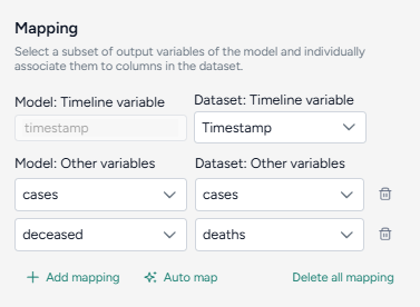
Only relevant variables need to be mapped. For example, if the model includes susceptible and recovered states, but the data only includes infected, you only need to map the infected state. States like susceptible populations that are typically not observed may not be mappable.
Automatically map the dataset and model configuration
If you enriched the model and dataset with concepts, click Auto map to speed the alignment process.
- Click Auto map.
- Review and edit the mappings as needed.
Manually map between the data and model configurations
- Select the Timestamp column from the dataset.
-
For each variable of interest:
- Click Add mapping.
- Select the corresponding state from the model configuration.
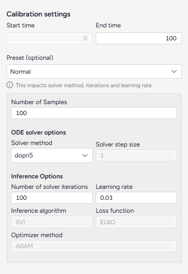
Configure the run settings
The Calibrate run settings allow you to fine-tune the time frame, solver behavior, and inference process. By adjusting these settings, you can balance performance and precision.
Configure the run settings
The run presets help you quickly choose between fast calibrations, which process quickly but are less accurate, and the normal setting, which is slower but more precise.
- Choose the Start and End time.
- Select a Preset, Fast or Normal.
Advanced settings
Using the following advanced settings, you can further optimize the computational efficiency and thoroughness of the calibration:
- Number of samples: Number of calibration attempts made to explore the parameter space and identify the best fit.
- ODE solver options determine the approach for solving the system's equations during calibration:
- Solver method: dopri5 provides more accurate results with finer calculations, while euler performs simpler, faster calculations.
- Solver step size: Interval between calculation steps, influencing precision and computational cost.
- Inference options control how model parameters are estimated during calibration:
- Number of solver iterations: Number of steps to take to converge on a solution.
- Learning rate: Step size for updating parameters during the optimization process.
- Inference algorithm: Stochastic Variational Inference (SVI), which estimates parameters probabilistically.
- Loss function: Evidence Lower Bound (ELBO), which guides parameter updates by balancing data fit and model complexity.
- Optimize method: ADAM, an algorithm for efficient parameter updates.
Tip
Consider using minimum settings—such as end time 3, number of samples at 1, and the euler solver method—to check whether the calibration can run to completion with the given mapping.
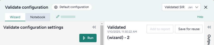
Create the calibrated configuration
Once you've configured all the calibration settings, you can run the operator to generate a new calibrated configuration. The new configuration becomes a temporary output for the Calibrate operator; you can connect it to other operators in the same workflow. If you want to use it in other workflows, you can save it for reuse.
Create a new calibrated configuration
- Click Run.
Choose a different output for the Calibrate operator
- Use the Select an output dropdown.
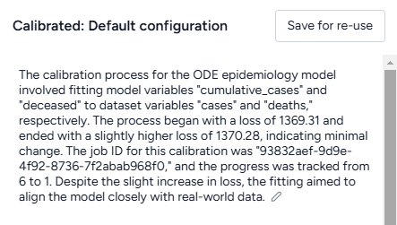
Understand the results
When the calibration is complete, Terarium creates an AI-generated description of the results.
Results are also presented as a series of customizable charts that show:
-
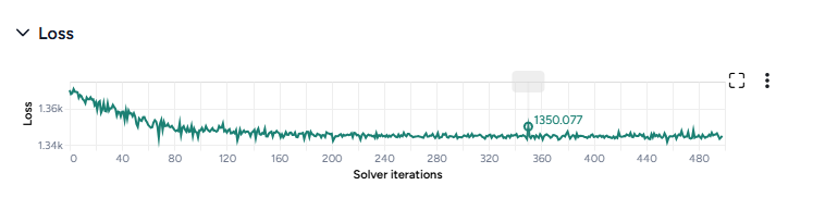
Loss
The loss chart shows the error between the model's output and the calibration data. A decreasing loss indicates successful calibration.
-
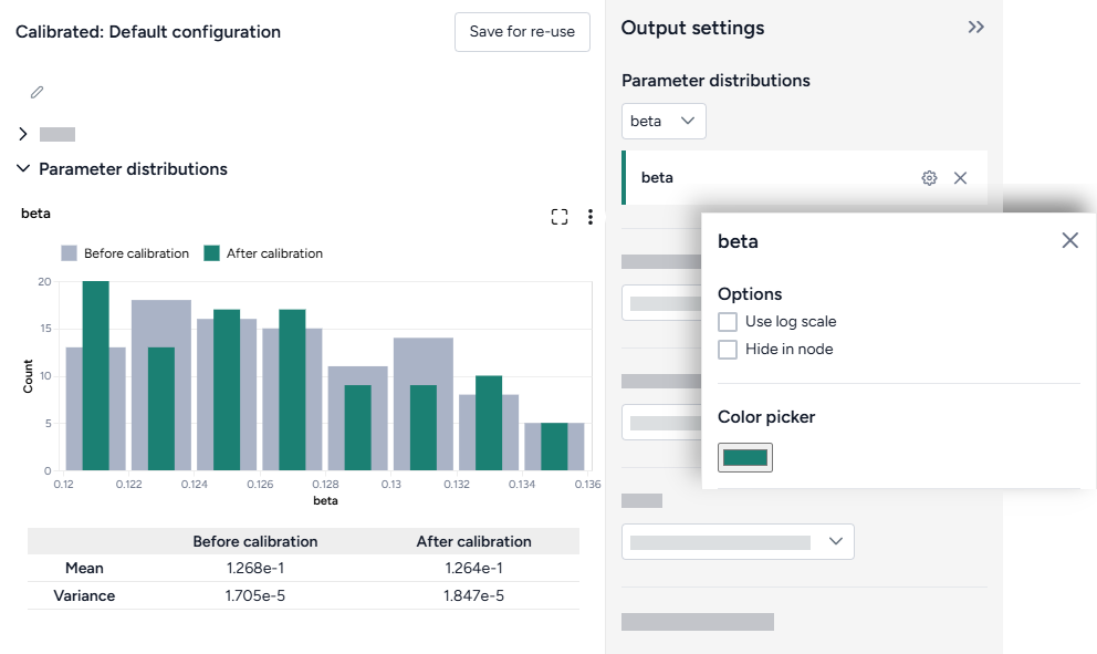
Parameter distributions
The parameter distribution plots show the range of parameter values before (grey) and after (green) calibration. A table below the plot also shows the mean and variance.
-
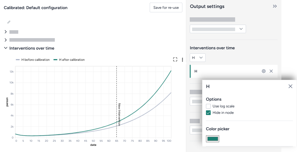
Interventions over time
The interventions over time charts show any selected interventions before (grey) and after (green) calibration.
-
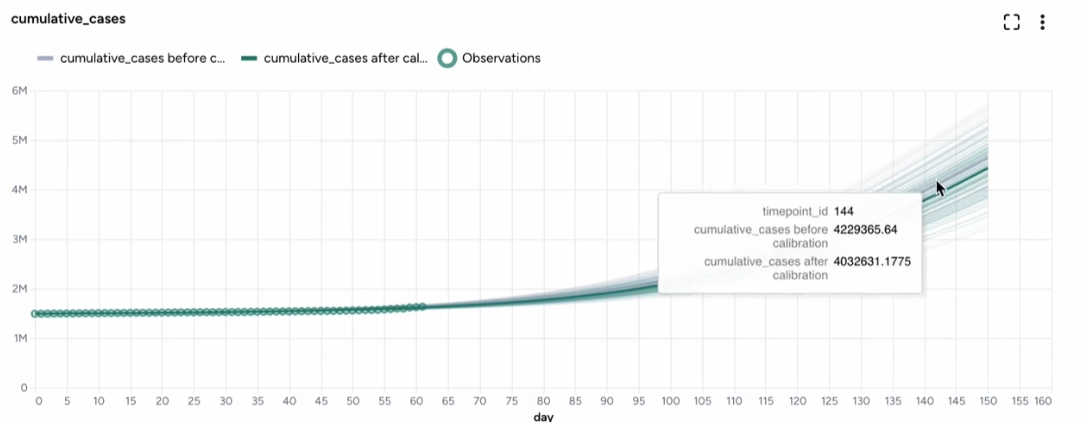
Variables over time
To aid visual validation, the variables over time charts compare the effects of calibration for state variables, observables, and the historical data.
- The grey line represents the model before calibration.
- The colored line represents the model after calibration.
-
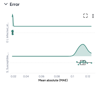
Error
The error plots show the mean absolute error (MAE) for each variable of interest.
-
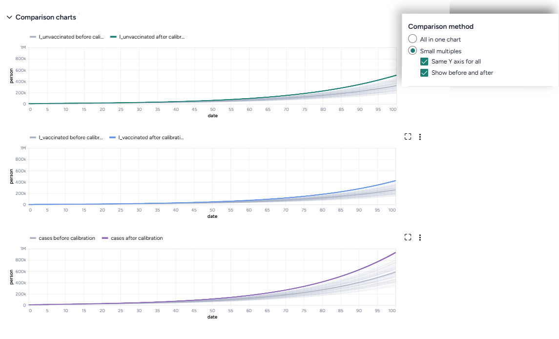
Comparison charts
The comparison charts let you plot two or more parameters, model states, or observables to visualize how they changed after calibration.
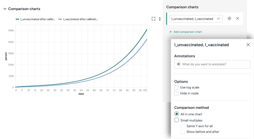
Additional options for comparison charts let you split the selected variables into separate small multiples charts. You can further customize the small multiples charts to show the same Y axis for all charts or incorporate plots of the variables before calibration.
Access the Output settings
Settings for the various chart types are available in the Output settings panel.
- Click Expand to expand the Output settings.
Choose which variables to plot
- Select the variables from the dropdown list.
Access additional chart settings
Some chart sections let you select additional options for each chart or variable. To access these settings:
- Click Options .
Annotate charts
Adding annotations to charts helps highlight key insights and guide interpretation of data. You can create annotations manually or using AI assistance.
Add annotations that call out key values and timesteps
To highlight notable findings, you can manually add annotations that label plotted values at key timesteps on loss, interventions over time, variables over time, and comparison charts.
- Click anywhere on the chart to add a callout.
- To add more callouts without clearing the first one, hold down Shift and click a new area of the chart.
Prompt an AI assistant to add chart annotations
You can prompt an AI assistant to automatically create annotations on the variables over time and comparison charts. Annotations are labelled or unlabelled lines that mark specific timestamps or peak values. Examples of AI-assisted annotations are listed below.
-
Describe the annotations you want to add and press Enter.
Draw a vertical line at day 100Draw a line at the peak S after calibrationDraw a horizontal line at the peak of default configuration Susceptible after calibration. Label it as "important"Draw a vertical line at x is 10. Don't add the labelDraw a line at x = 40 only after calibration
Display options
You can customize the appearance of your charts to enhance readability and organization of the results.
Change the chart scale
By default, charts are shown in linear scale. You can switch to log scale to view large ranges, exponential trends, and improve visibility of small variations.
- Select or clear Use log scale.
Hide in node
The variables you choose to plot appear in the results panel and as thumbnails on the Calibrate operator in the workflow. You can hide the thumbnail preview to minimize the space the Calibrate node takes up.
- Select Hide in node.
Change parameter colors
You can change the color of any variable on the parameter distribution, interventions over time, and variables over time charts to make your charts easier to read.
- Click the color picker and choose a new color from the palette or use the eye dropper to select a color shown on your screen.
Save charts
You can save Calibrate charts for use outside of Terarium. Download charts as images that you can share or include in reports, or access structured JSON that you can edit with Vega .
Save a chart for use outside Terarium
- Click and then choose one of the following options:
- Save as SVG
- Save as PNG
- View source (Vega-Lite JSON)
- View compiled Vega (JSON)
- Open in Vega Editor
Troubleshooting
Recommended run settings
It's recommended you run calibrations using the dopri5 Solver method.
Simulate first
Before you calibrate, confirm that your model can be simulated.
Uncertainty and number of samples
If your model has uncertainty in parameter values, only one sample is needed. Change Number of samples to 1 (the default is set to 100).
Simulation length and number of samples
If you plan to simulate your calibrated model for a long time or with a large number of samples (for example, End time or Number of samples > 100), set them to a lower value (10 or 20) first and run a check for errors.
Error messages
PyCIEMSS error messages should offer guidance on how to proceed. Error messages from Pyro or torchdiffeq may be less clear.
If you see a messages referencing Cholesky factorization (including The factorization could not be completed because the input is not positive-definite) or AssertionError with underflow in dt 0.0:
- If you were able to simulate the model, check that your model and the dataset are on the same scale. Errors are likely if:
- The model assumes a population of 10 million, while the dataset has a population of 1,000.
- The model is normalized to a population of one while the dataset is not.
- Make sure your initial conditions are consistent with your dataset. They don't need to be an exact match, but errors are likely if they are too far off.